
POST ROAD PUMPKIN ALE REDESIGN
BROOKLYN BREWERY | PACKAGING DESIGN
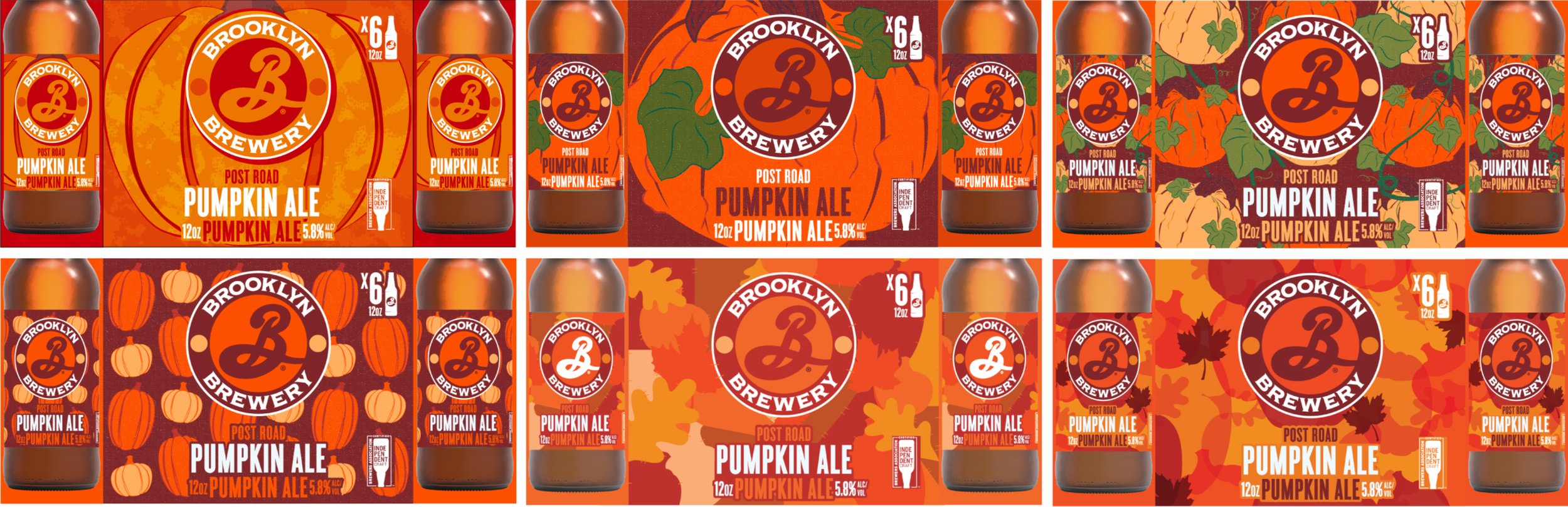
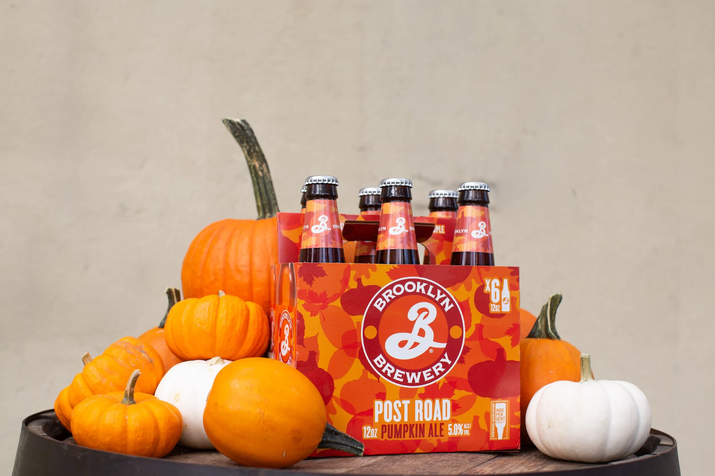
The design for Post Road Pumpkin Ale was part of Brooklyn Brewery’s packaging refresh. It had been years since Post Road had been updated, so it was an exciting opportunity to be able to work on this project. The goal was to make this feel like a true fall seasonal, not skewing towards any particular holiday. The leaf and pumpkin pattern was designed to look like fall foliage with the use of transparency within the shapes.
There’s always the challenge within packaging of translating the design across many different formats. We have print restrictions to consider, and especially for Post Road, we needed to be sure that transparency would be conveyed properly. We also had to consider the refreshed layout and how the pattern we were creating would fit in with the rest of our portfolio.
My roles in this project were design conception, full execution across all formats, vendor communications and vendor approvals.
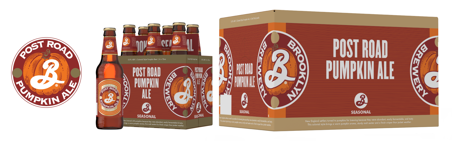
ORIGINAL PACKAGING LINEUP
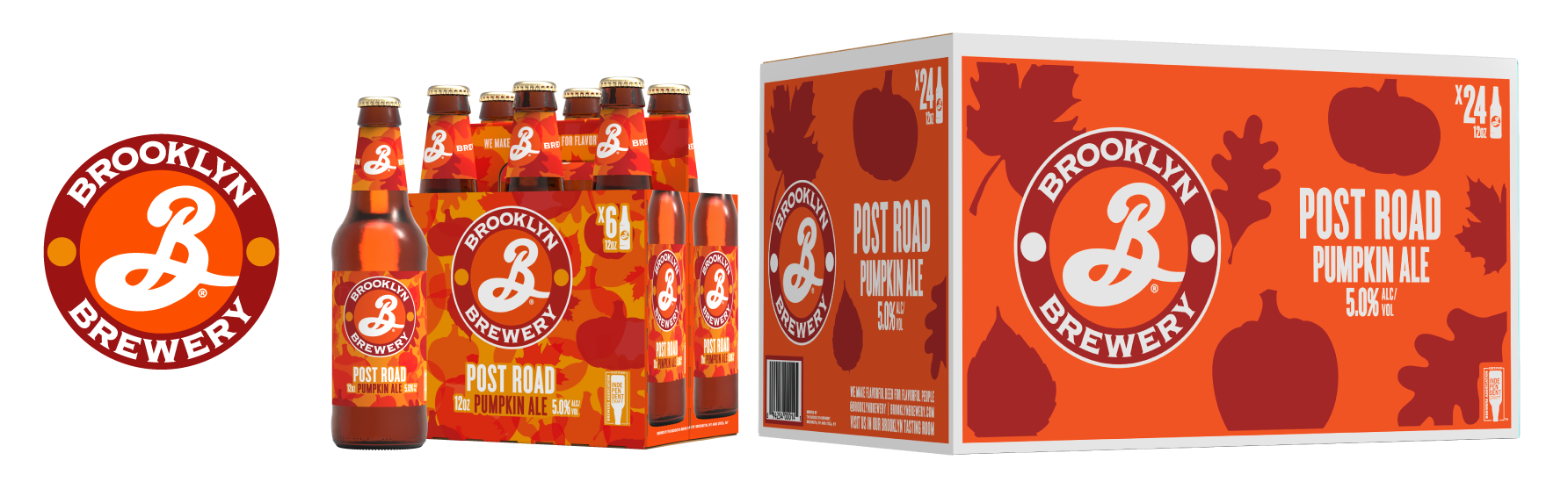
UPDATED PACKAGING LINEUP
The redesign for Post Road had to be illusive, not on the nose. Ultimately the layered/multiplied leaves and pumpkins gave the impression of beautiful fall foliage, whether it was looking up into the trees as the sun streams through the colored leaves giving them an almost transparent quality, or scattered on the ground after a rainfall.
A PEEK INTO THE PROCESS

PATTERN SAMPLE
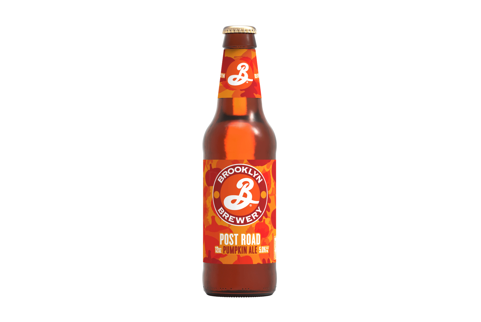
PHOTOS

CREDITS:
Brand Director: Abby Rand
Art Director: Ashley Swope
Photography: Ashley Cobb, Paige Snider, Joe Battiato
All assets owned by the Brooklyn Brewery.