
EAST IPA REFRESH
BROOKLYN BREWERY | PACKAGING DESIGN
This update for East IPA was part of Brooklyn Brewery’s overall packaging refresh. The original pattern of luggage tags was feeling disconnected from the evolution of the brand, and we wanted to bring the design back to its New York roots. This project ended up being a collaboration of Brooklyn’s full design team, brainstorming what icons best represented New York City.
My roles in this project were icon development and final design execution, dieline file set-up, vendor file submissions, vendor communications, and proof approvals.

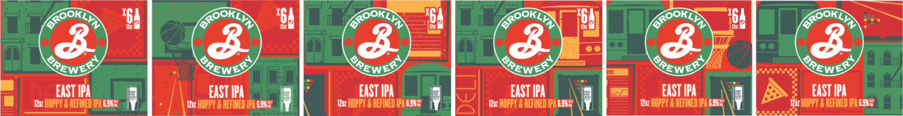
ORIGINAL PACKAGING LINEUP
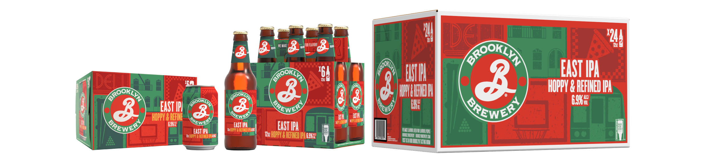
UPDATED PACKAGING LINEUP
There was a full icon exploration where we narrowed down which icons were the most ‘New York’ and what fit the package the best. One of the most complicated parts of packaging design is the translation between packaging formats, especially with puzzle piece artwork.
A PEEK INTO THE PROCESS
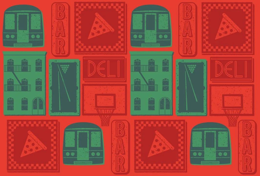
FINAL FULL COLOR ICON PATTERN
FINAL DUOTONE COLOR ICON PATTERN

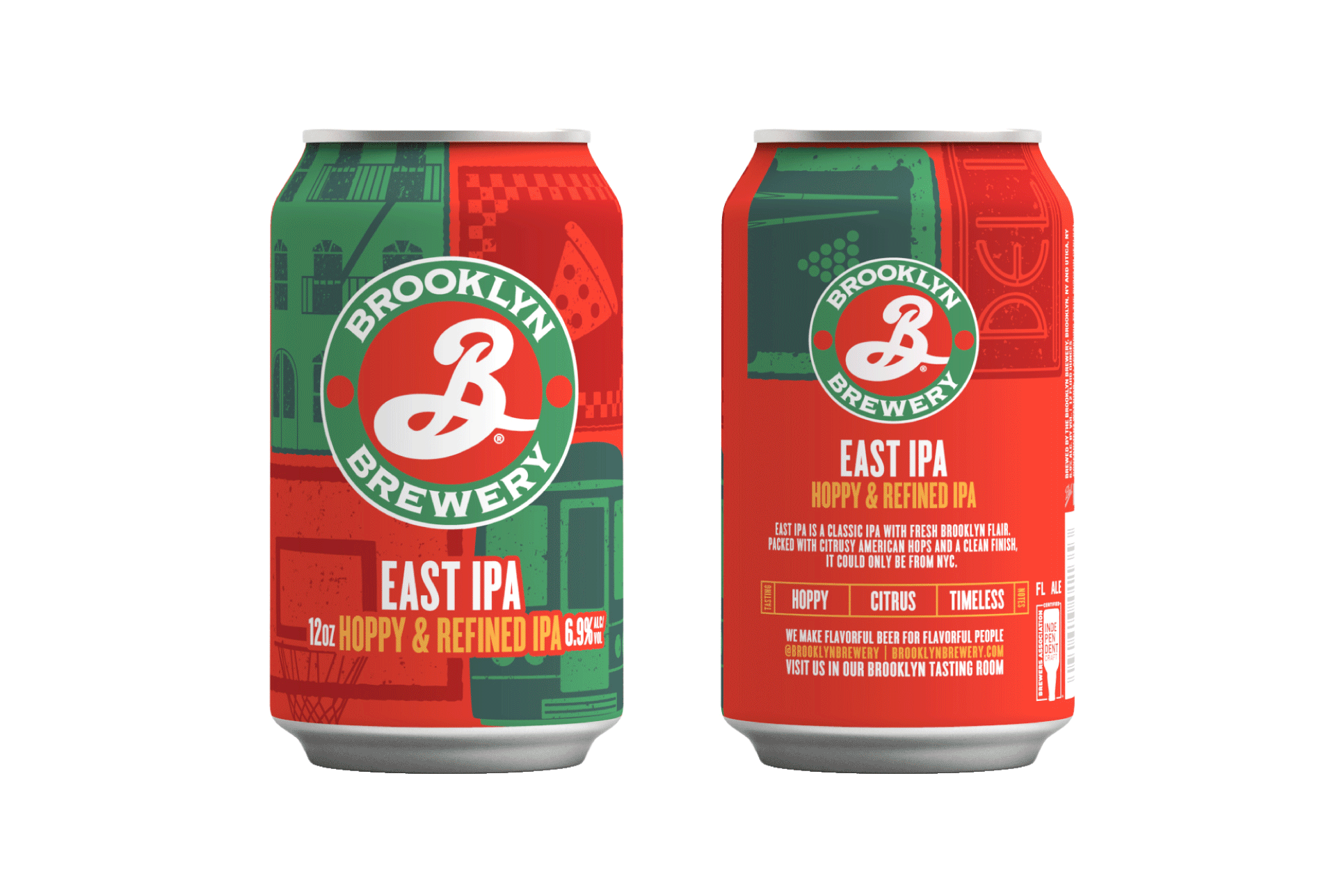
PHOTOS


CREDITS:
Brand Director: Joe Battiato
Art Director: Ashley Swope
Collaboration Credits: Ashley Swope & Ali Graulty
Photography: Eva Cruz
All assets owned by the Brooklyn Brewery.