
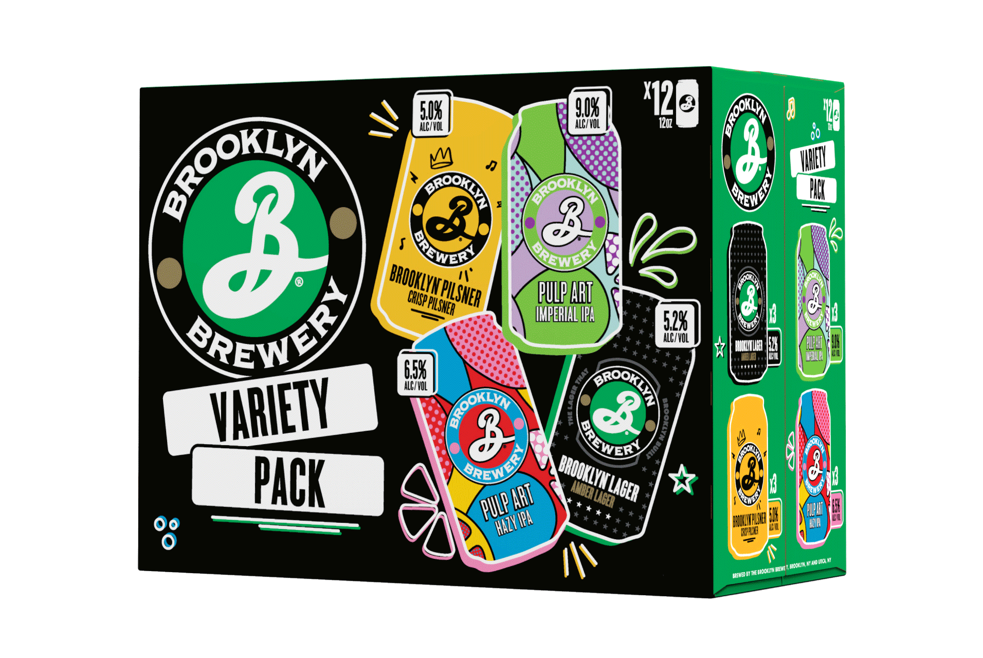
BROOKLYN BREWERY VARIETY PACK REDESIGN
BROOKLYN BREWERY | PACKAGING DESIGN
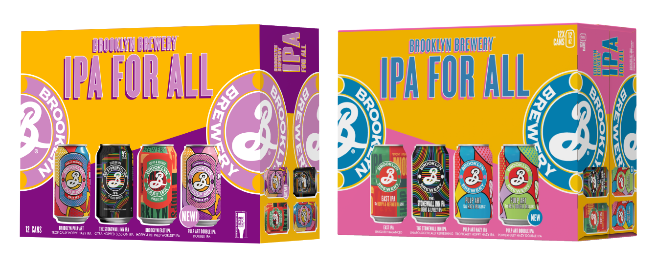
There have been quite a few versions of the Brooklyn Variety Pack - most recently updated from ‘IPA For All’. Even with the consideration of Brooklyn Brewery’s packaging guidelines, there was a bit of creative freedom with this design and I took advantage to try and push the limits. Generally pretty structured in the past, this updated design breaks the mold and has been updated to many variations throughout the 4 years it’s been in market.
My roles in this project were design conception, full execution, continued updates, vendor communications and vendor approvals. Pulp Art can icon was created by Thirst, rest of brands recreated by the Brooklyn Brewery
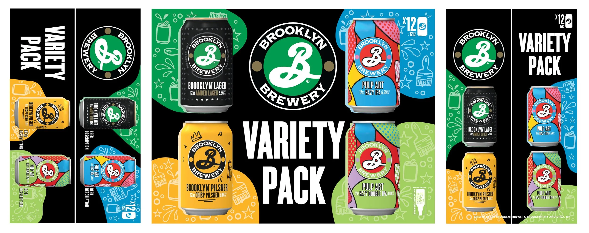
ORIGINAL PACKAGING LINEUP
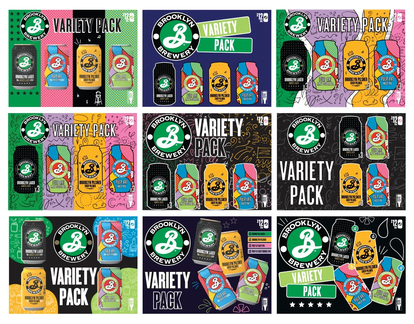
We had the can icons supplied to us by (AGENCY) so it thought it would be fun to lean into a more illustrative style for the redesign. The final is loosely based on a chalkboard style with simple but bold line work illustrations and color blocked panels. Elements from each can were used in the doodles.
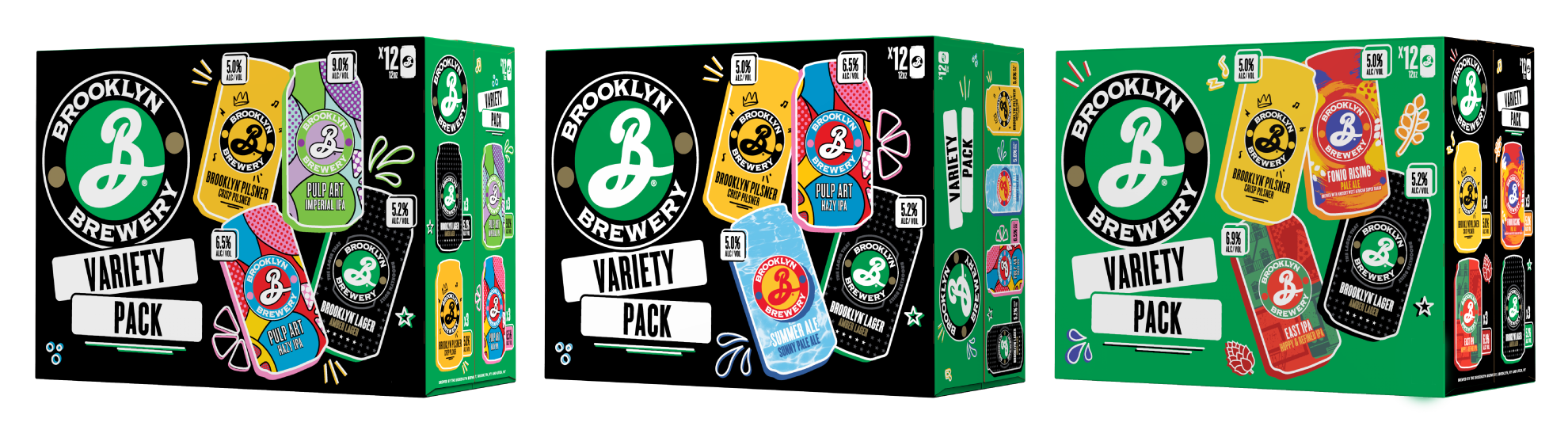
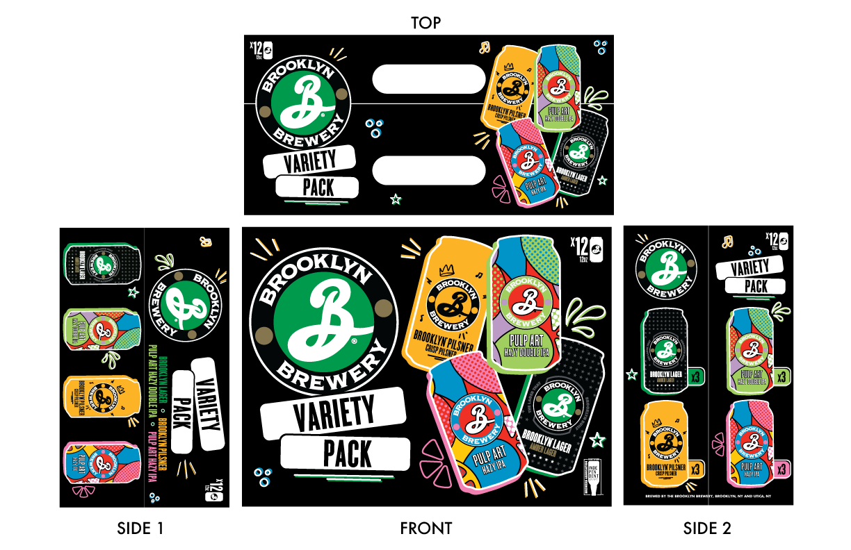
UPDATED PACKAGING LINEUP (A FEW VERSIONS)
A PEEK INTO THE PROCESS
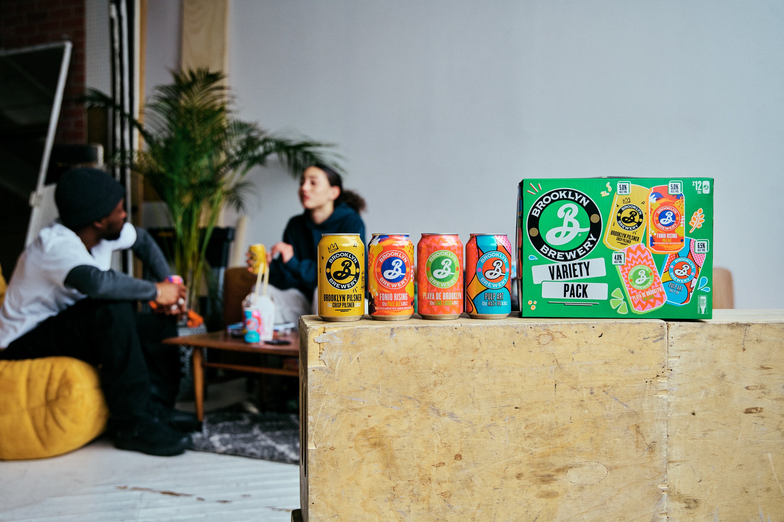
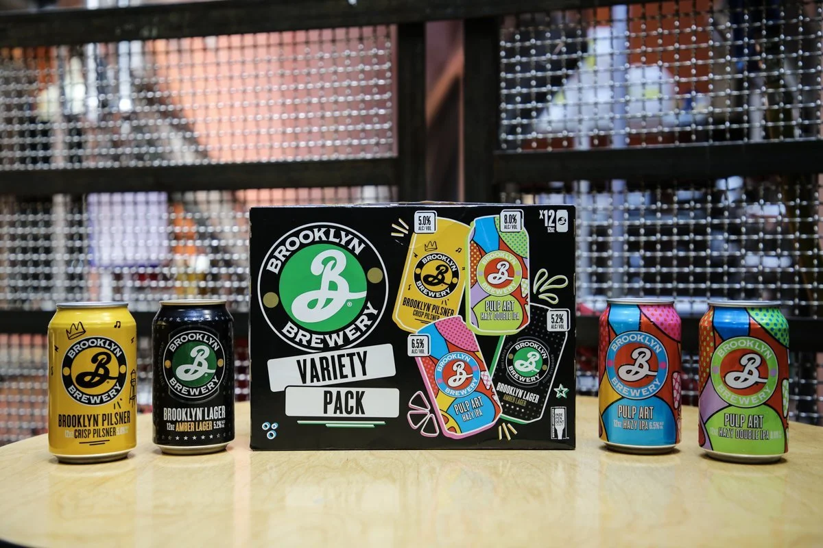
PHOTOS
CREDITS:
Brand Directors: Abby Rand & Joe Battiato
Art Director: Ashley Swope
Photography: Brian Kelley, Joe Battiato
All assets owned by the Brooklyn Brewery.